
How to Choose a White Paint and Stop Second-Guessing It
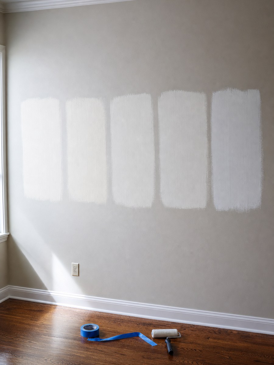
Undertones, room orientation, and the Chicago winter light that makes a June color choice look wrong in January. A method that ends the decision in a weekend.
There is a specific kind of despair that arrives on day three of choosing a white paint. Six samples on the wall, all of them white, and somehow three of them are wrong in a way you cannot name.
“Why does this white look pink in my living room?”
Because whites have undertones, and your room is voting on them. At ADS Building & Remodeling we paint houses across Buffalo Grove, Arlington Heights, Glen Ellyn, Naperville, Wheaton, and Schaumburg, and this decision derails more clients than tile ever has. Here is the method that ends it in a weekend.
Every White Leans Somewhere
Paint whites are built by adding tiny amounts of pigment to a base, and that pigment shows up under the right light. In practice you are choosing between four families:
- Warm whites, leaning yellow or cream. Cozy, forgiving, and they can read as dingy in a dark north-facing room.
- Cool whites, leaning blue or grey. Crisp and modern, and they can turn clinical in a room with little natural light.
- Greige whites, a touch of brown and grey. The most flexible in Chicago-area homes, because they hold up in both winter grey light and summer green light.
- True whites, minimal pigment. Best for trim, ceilings, and galleries, harsh on large wall areas.
The Room Is Half the Decision
North-facing rooms get cool, indirect light all day. Cool whites go grey and lifeless here. Use a warm or greige white.
South-facing rooms get warm light for most of the day, which amplifies yellow undertones. A cooler or neutral white balances it.
East-facing rooms are warm in the morning, cool by afternoon. Neutral and greige whites handle the swing.
West-facing rooms get intense warm light in the evening. Any white with yellow in it will glow orange at 6 pm in July.
Then there is the Chicago-specific factor: from November through March the light outside is grey for weeks at a time. A white chosen in June under leafy green light behaves differently in January. This is the single most common reason clients repaint.
What Else in the Room Is Voting
- Flooring. A red-toned oak floor throws warm light onto the lower wall. A grey-toned floor cools everything.
- Countertops. A white quartz with grey veining will make a warm white look yellow beside it.
- Cabinets. If cabinets and walls are both white, they must either match exactly or differ clearly. A near-miss reads as a mistake.
- Bulb color. A 2700K bulb warms every white in the room. A 4000K bulb cools it. This is why the sample looked different in the store.
- The trees outside. In summer, green light reflects through windows and shifts everything. This is real and it surprises people every year.
The Method That Works
1. Test Big, Not Small
Paint at least 12 by 12 inch squares, two coats, directly on the wall. Small chips lie because they are surrounded by other colors. Use several walls in the same room, including one near a window and one in the darkest corner.
2. Look at Three Times of Day
Morning, mid-afternoon, and at night with your lights on. The nighttime look matters more than people think, because that is when you are home.
3. Put White Paper Beside It
A sheet of printer paper is a near-true white. Hold it against each sample and the undertone becomes obvious immediately. This one trick solves most of the confusion.
4. Test Against the Fixed Elements
Hold the sample against the counter slab, the floor, the cabinet door, and the tile. Those things are staying. Paint is the flexible one, so it adapts to them, not the other way around.
5. Commit to a Trim Relationship
Either the trim is clearly brighter than the walls, or it matches the walls exactly in a higher sheen. Both are correct. Half a step apart looks like an accident.
Sheens, Settled
- Flat or matte: ceilings, and formal rooms without children
- Eggshell: most living areas and bedrooms
- Satin: kitchens, bathrooms, hallways, mudrooms, anywhere that gets wiped
- Semi-gloss: trim, doors, and cabinetry
Higher sheen means more durability and more visible wall imperfection. In older homes with wavy plaster, that trade matters, and eggshell is usually the ceiling of what looks good.
A Shortcut for the Impatient
If you want to stop thinking about it: pick a soft neutral white with a whisper of greige for the walls, use a brighter true white in semi-gloss for trim and doors, and use the same wall color throughout the main floor so the sight lines stay calm. That combination works in a very high percentage of Chicago suburban homes and photographs well in any season.
Then spend the energy you saved on the accent decision that actually shows: one room in a real color, ideally the powder room or the office.
Common Questions
Should the ceiling be the same white as the walls?
A flat version of the wall color, or a dedicated ceiling white. Both work. What does not work is a bright white ceiling above a warm white wall in a low room, which visually flattens the space.
How many gallons will I need?
About 350 to 400 square feet per gallon per coat, and plan on two coats. Always buy one extra gallon and store it labeled. Touch-ups years later never match a fresh mix perfectly.
Is expensive paint worth it?
Yes, and it is one of the cheapest quality upgrades in a project. Better coverage, better durability, easier touch-ups. The premium across an entire house is usually a couple hundred dollars.
Important Note
Color behaves differently in every room, which is why no article can name the right white for your house. What we can do is look at your light, your floors, and your fixed finishes and narrow it to two or three. At ADS the in-home consultation and the selection conversation are complimentary.
Stuck Between Six Samples?
If you are choosing colors for a project in Buffalo Grove, Arlington Heights, Glen Ellyn, Naperville, or a nearby Chicago suburb, test on the wall, look at night, and hold a sheet of paper next to it. Then stop looking.
At ADS Building & Remodeling, we provide:
- A complimentary design consultation and 3D rendering
- Color and finish selections coordinated with your actual floors, counters, and light
- A fixed-price quote that doesn’t move after you sign
- In-house crew, proper surface preparation, and a final walk-through before we call it done
White is not a color, it is a relationship between the light in your house and everything already in the room.